
Juicer.io’s feed customization runs on three layout styles – Grid, Slider, and List – each with several ready-made templates, 12 in total: five Grid templates (Default, Minimal, Highlights, Dark, Masonry), five Slider templates (Default, Minimal, Dark, Highlights, Widget), and two List templates (Default, Dark). Pick your layout based on space and content type: Grid for image-heavy visual walls, Slider for compact spaces that need motion, and List for text- and link-heavy platforms like X and LinkedIn.
What Social Media Feed Customization Means in Juicer.io
The essence of feed style customization in Juicer social lies in the templates: a template is a pre-designed layout that controls how your feed (or full social wall) looks and behaves on your site, no coding required. As you know, you have plenty of style options. But also every template is fully customizable, so once you’ve picked a starting point you can adjust colors, fonts, spacing, and columns until it matches your site’s branding.
Setting one up is two steps. Pick a layout from the templates library, then copy the embed code Juicer generates straight into your website’s HTML (or a WordPress shortcode, if that’s your platform). And it’s not a one-time decision — switch templates anytime from your dashboard, and your live feed updates automatically with the new design.
The right starting point depends on two things: which social platforms feed your social media aggregator (a TikTok- and YouTube-heavy feed reads differently in a Grid than a List), and how your brand looks and feels. We’ll break both down point-by-point below.
Live examples: What a Customized Juicer Social Feed Looks Like
Different layouts help your feed resonate with your brand… below is a look at each Juicer social template style in action with Juicer social media feed examples along with two pros / best use-cases and one con for each category.
Grid templates
Five styles: Default, Minimal, Highlights, Dark, and Masonry.
Grid: Default
A classic three-column grid with square thumbnails, the same balanced layout most brands start with.

- Works for nearly any brand voice, from corporate to casual; nothing about the layout skews the tone.
- Uniform square crops keep mixed sources (Instagram, Facebook, LinkedIn) looking consistent side by side.
- Con: square crops can cut off vertical or landscape-heavy content, like TikTok or YouTube thumbnails.
Grid: Minimal
A tight 4:5 portrait gallery with the chrome stripped back, so the imagery leads.

- Ideal for fashion, photography, or product brands where visuals need to do the talking.
- Portrait crops flatter Reels covers and TikTok thumbnails.
- Con: text-heavy posts lose context without visible captions.
Grid: Highlights
A hero post pinned above a supporting gallery, built to spotlight one story without hiding the rest of the juicer.io feed.

- Great for campaign pages or product launches where one post deserves top billing.
- Gives editors control over what visitors see first without moderating out everything else.
- Con: needs a genuinely strong “hero” post… feeds without a standout piece feel unbalanced.
Grid: Dark
The same square three-column grid as Grid Default, rebuilt on a charcoal background.

- Matches dark-themed websites without visual clash — the modernized version of the old Night style.
- Bold colors and jewel-tone palettes pop harder against black than white.
- Con: can read as heavy or moody for brands aiming for approachable or playful.
Grid: Masonry
A Pinterest-style layout that auto-sizes each post to its natural height instead of forcing a uniform crop.

- Best fit for UGC walls and event feeds where raw, unedited content should feel busy and alive.
- Mixed aspect ratios (portrait Reels next to landscape photos) sit naturally without cropping.
- Con: the least predictable, “on-brand-controlled” layout of the grid templates, a harder sell for polished, minimal brands.
Slider templates
Another five styles here too: Default, Minimal, Dark, Highlights, and Widget.
Slider: Default
A horizontal carousel showing four posts at a time with manual arrow navigation.

- Saves vertical space while keeping a real presence on the page; good for sites tight on room.
- Visitor-controlled pacing suits brands going for editorial over “salesy.”
- Con: posts past the visible four require a click, so lower-engagement visitors may never see them.
Slider: Minimal
An auto-playing carousel of 4:5 portrait tiles, tuned for Instagram- and TikTok-style content.
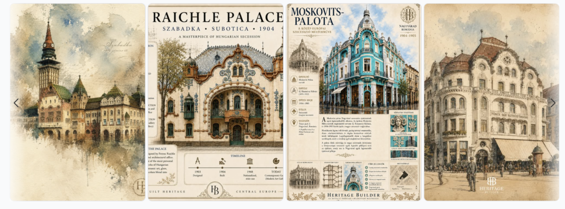
- Motion draws the eye; a strong fit for social-first, younger-skewing brands.
- Portrait tiles show TikTok and Reels content at their native, most flattering crop.
- Con: auto-play can feel distracting on content-heavy pages like blogs or long landing pages.
Slider: Dark
The dark-mode counterpart to Slider Default: a four-tile carousel on a charcoal background.
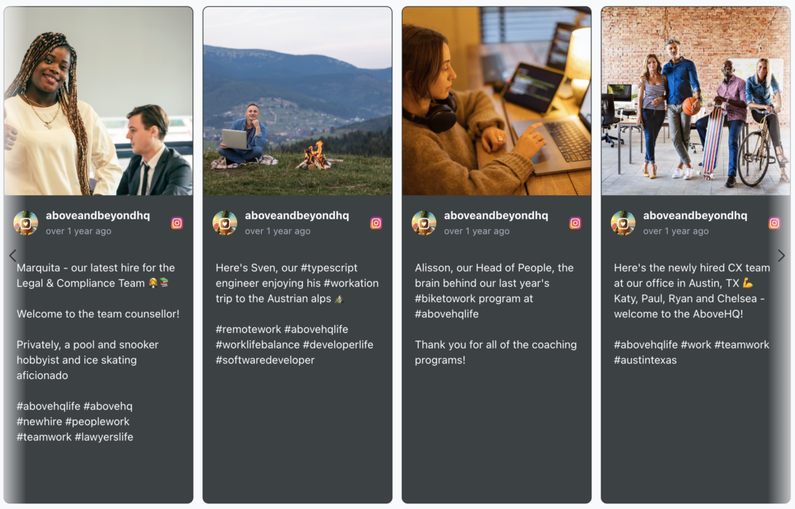
- Pairs naturally with dark website themes without a jarring white block breaking the page.
- Suits sleek, edgy, or premium brand positioning.
- Con: same visibility limit as Slider Default, only four posts ever visible at once.
Slider: Highlights
A hero-led carousel where one large post auto-rotates alongside a strip of supporting posts.
- Newsroom and event-recap energy; strong for brands publishing frequently or covering live events.
- Auto-rotation keeps the feed moving without visitor interaction, useful for lobby displays or kiosks.
- Con: rotation speed needs tuning; too fast and captions get unreadable, too slow and it feels static.
Slider: Widget
A compact, single-column auto-playing slider built for sidebars and footers rather than full-width sections.

- The smallest footprint of any template, ideal when you only have a sliver of page real estate.
- Still shows live social proof without competing with primary page content.
- Con: only one post visible at a time, so it takes longest for a visitor to see feed variety.
List templates
Two styles: Default and Dark.
List: Default
A single-column reading layout that preserves each post’s native aspect ratio, built for text- and link-heavy platforms.
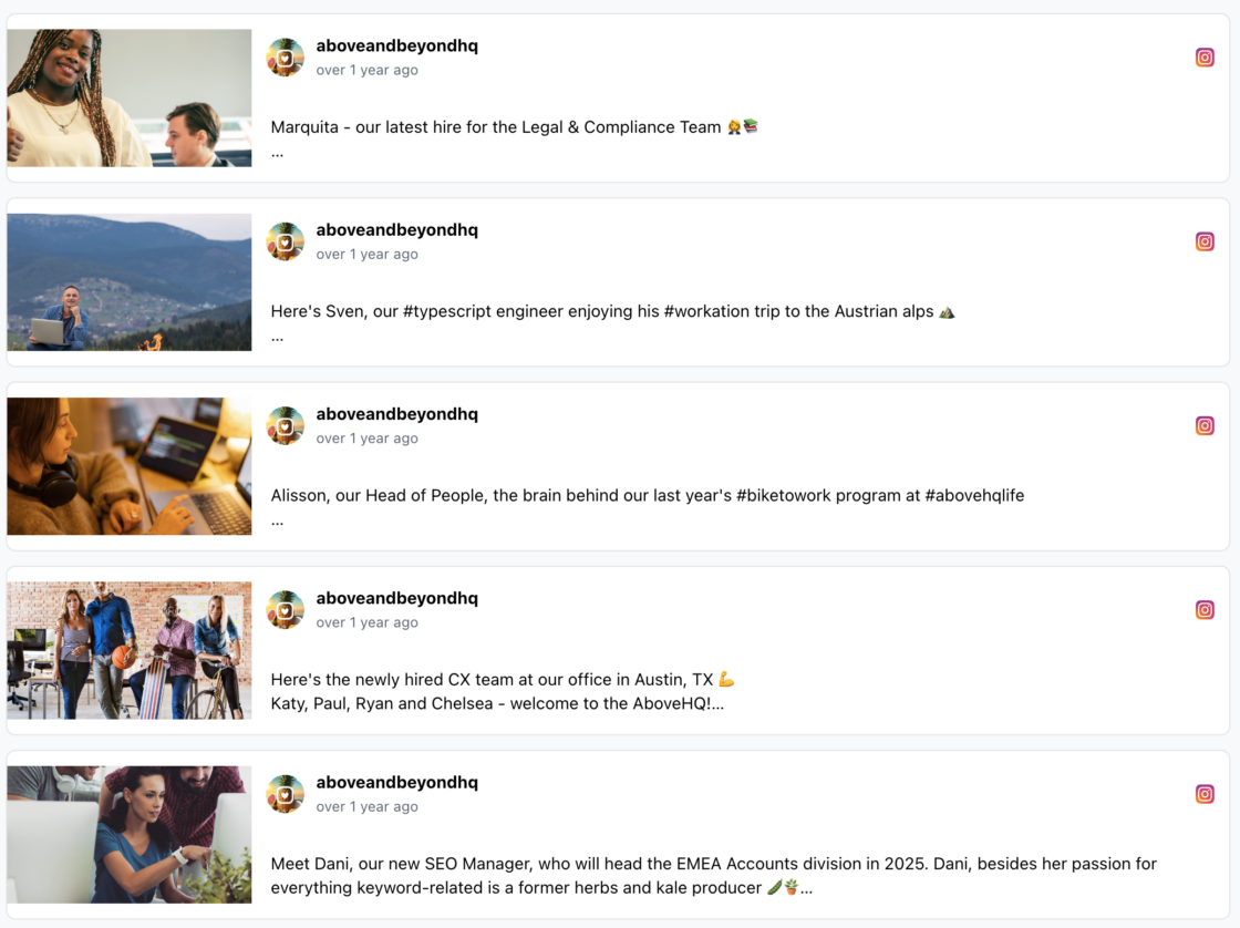
- Best match for X and LinkedIn content, where the text carries as much weight as the image.
- Full captions stay visible without hover states or truncation; good for informational or long-form brands.
- Con: takes up more vertical scroll space than a grid for the same number of posts.
List: Dark
The same single-column list, rebuilt on a charcoal background for dark-themed sites.
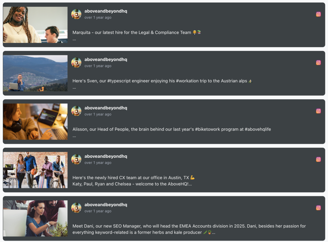
- Suits editorial, agency, or media-brand sites already running a dark UI.
- Keeps List Default’s readability while matching darker brand palettes.
- Con: still a vertical-scroll-heavy layout, not the most compact option for limited space.
How to Choose the Right Style for Your Brand
Match the table to your brand’s personality and the platforms you post to most; every template below pulls from the descriptions above. We’ve briefed every Juicer social media platform that vibes the best with each style.
| Template | Brand personality | Platforms it flatters |
|---|---|---|
| Grid Default | Balanced, all-purpose, corporate-to-casual | Instagram, Facebook, LinkedIn |
| Grid Minimal | Visual-first, fashion, photography | Instagram, TikTok Reels |
| Grid Highlights | Campaign-driven, launch-focused | Instagram, YouTube |
| Grid Dark | Sleek, edgy, premium | LinkedIn, X |
| Grid Masonry | Raw, community-driven, UGC-heavy | Instagram, TikTok, hashtag walls |
| Slider Default | Understated, space-conscious | Any platform, general use |
| Slider Minimal | Youthful, social-first, playful | TikTok, Instagram Reels |
| Slider Dark | Sleek, premium, moody | X, LinkedIn |
| Slider Highlights | Newsroom, high-frequency publisher | X, Facebook, YouTube |
| Slider Widget | Minimal-footprint, subtle | Any (sidebar/footer placement) |
| List Default | Text-first, professional, B2B | X, LinkedIn |
| List Dark | Editorial, agency, media | LinkedIn, X, blog RSS |
Customizing Colors, Layout, and Platform Sources
Beyond picking a template, every Juicer social wall gives you granular control without touching code: custom CSS to match your brand’s colors and fonts, adjustable column count and post spacing, a configurable posts-per-page limit, and caption truncation with a customizable “Read More” label. Pull from any mix of platforms your social media aggregator supports (Instagram, TikTok, YouTube, LinkedIn, X, and 15+ others) and filter the feed by source or hashtag directly in the embed code.
Moderation power scales with your plan: manual, post-by-post moderation on Free and Lite, automatic moderation on Starter, and automatic-plus-AI moderation on Pro, useful once you’re pulling from enough sources that eyeballing every post stops being realistic. Refresh rate and source limits scale too, from a 24-hour refresh on one source (Free) down to a 10-minute refresh across 30 sources (Pro). See the full plan breakdown with all the available feed style customization Juicer.io offers.